Your website navigation is the backbone of your website. The overall structure has a significant impact on sales, conversions, and bounce rates – making it critical to the overall success of your marketing goals.
The average user forms an opinion of a website in 50-milliseconds and will only stay for 20-seconds before deciding the move on. You have a short window to grab their attention and point them towards an action. If website users can’t figure out what they’re supposed to do when they enter your website, they will leave to find a more user-friendly alternative – resulting in a loss of 50% of potential sales.
No element affects user experience and digital user behaviors as much as website navigation. By developing a clear user journey with defined paths, prospective customers are more likely to convert and become loyal brand advocates.
To develop a hierarchical website navigation that helps users find exactly what they need, it’s essential to implement best practices that make your structure more intuitive. Let’s take a look at why navigations have such a large impact on your website’s success and a few tips for execution.
Why is Website Navigation Important?
If you were to delete your website navigation, users would have no idea where to find your pricing, product listings, contact information, blog, and more. Feeling completely confused and turned off by your design, they would leave your website and purchase from a competitor instead. In fact, 88% of users are less likely to return to a website after a bad experience.
The labels and structure of your navigation not only organize the hierarchy of your website, but it also plays a huge role in optimizing your overall conversion rate. As a general rule of thumb, users should be able to land on any page on your website and quickly find what they need in three clicks. While users won’t follow a standard path every time, the goal is to help them discover information and inspire them to continue clicking more until they sign up for your newsletter, purchase a product, or more.
When developing a website navigation, you have a few different types to choose from:
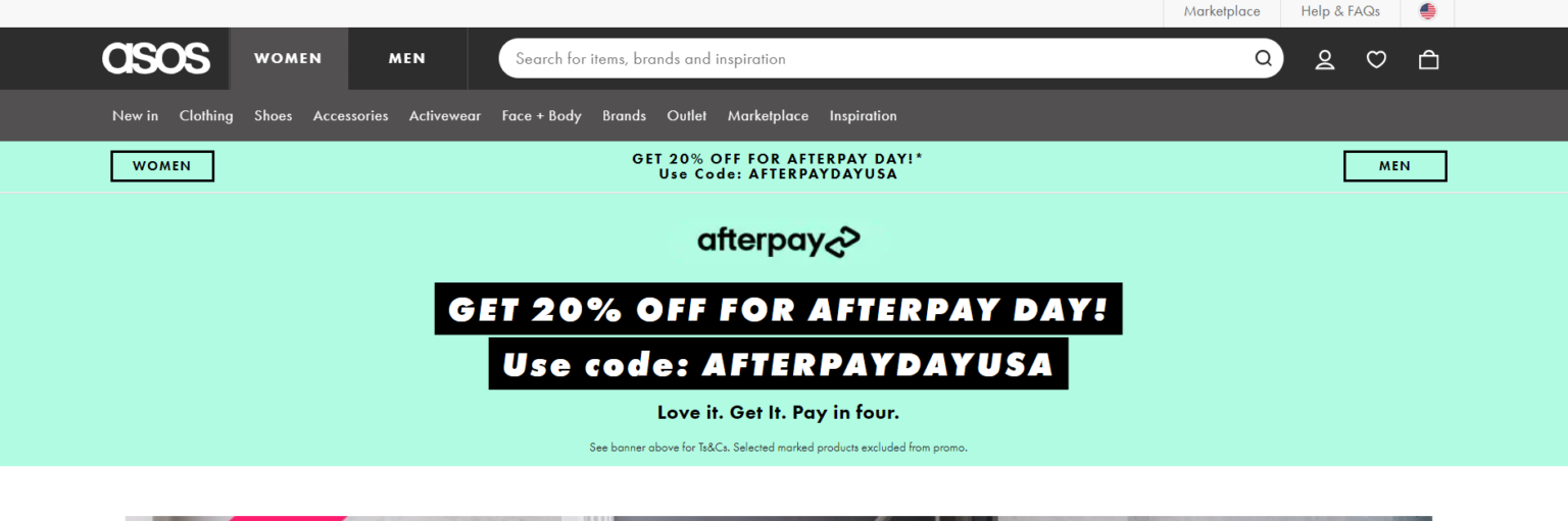
- Top menu: Aligned with how a user typically reads a website – from top to bottom and left to right.
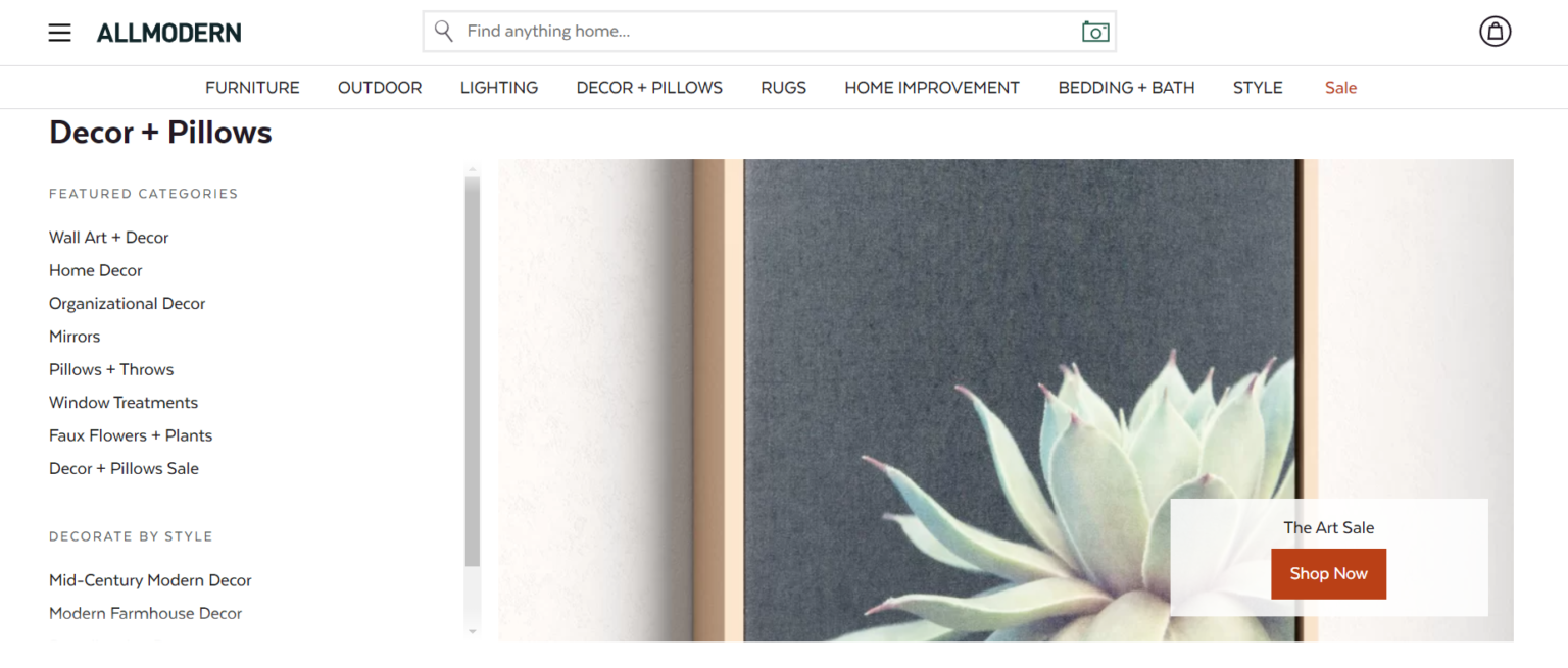
- Sidebar: Positioned to the right or left of a sub-category, often including filtering options.
- Footer: Placed at the bottom of a website, the footer contains links to the website’s main pages.
- Breadcrumbs: Found at the top of a page, it’s used typically for eCommerce websites or larger content hubs.
While each navigation type has its variations and best practices, deciding which will provide the most value for users is paramount to your website’s overall success.
Top Metrics for Measuring the Success of Your Navigation
When developing navigation, it’s essential to set objectives and KPIs around how you will measure the success of your website’s user experience. A good user experience not only increases your conversion rate but also has the opportunity to persuade users to come back and expand their customer lifetime value (CLV).
How do you know if your navigation is offering a good user experience? Take a look at the following elements you should be measuring to get started:
- Findability/completion rate
- Time to find
- Initial click
- Success path
- Difficulty/the most difficult items to find
By measuring the right KPIs and success metrics, you’re able to make a stronger case to key stakeholders around the navigation’s financial impact on ROI.
6 Tips for Making an Intuitive Website Navigation
Now that you understand the importance of your website’s navigation, it’s essential to design with best practices in mind to increase your ROI and improve the user experience. If you find that your website is getting traffic, but failing to generate conversions, take a look at these six tips for making your navigation more intuitive:
1. Choose an Expected Location
When it comes to designing your navigation, you should always prominently display the most important things to visitors. Some designers make the mistake of using a hamburger menu to save space, which makes the navigation available only when needed. However, hidden navigations often increase task completion time because users don’t always know what they’re looking for.
User expectations need to be leading your design strategy. Instead of hiding your navigation, place your menu where users expect to find it – the top bar, page headers, sidebars, or footer. Once you have the location pinned down, it should visually look different than the rest of the webpage content. Consider using whitespace to separate the content from your navigation so users can easily see what’s clickable.
2. Keep it Descriptive and Short
Your navigation shouldn’t be a list of vague and generic headings. If your user doesn’t understand what each option on your menu means, they’re less likely to navigate beyond your home page. Instead, consider using keywords that are unique to your business to help set user expectations and increase your potential conversions.
Did you know that your short-term memory can only retain seven items at a time? As your website grows with more pages and content, you may be tempted to expand your menu with more options. However, you need to keep the number of navigation titles brief, so your user can remember all of the options without having to go back and re-read everything. It’s recommended to only include seven menu options.

3. Develop a Clear User Path
Whether someone enters your website through a blog article or service page, they may not know exactly what they want or where they need to go. Your navigation needs to be the North Star – guide them towards spending more time on your site and eventually converting. Consider the following subtle ways you can guide users:
- Include the main menu at the top of every page with a defined call-to-action option
- Display your logo at the top left screen that links back to your homepage
- Showcase breadcrumbs at the top of every page that show the previous pages visited
- Include a sidebar with suggested pages to visit next
With a more intuitive navigation, you’re able to make it clear where the user currently is on your website and allow them to progress forward
4. Reduce Drop-down Menus
A common space-saving navigation feature, drop-down menus can be difficult to navigate and create a challenging mobile experience. Drop-down menus cause your users hesitation if they see too many options, prevent them from clicking on the highest-value pages, and cause accessibility concerns. If your drop-down menu only includes a few items, you need to consider if it’s worth having at all.
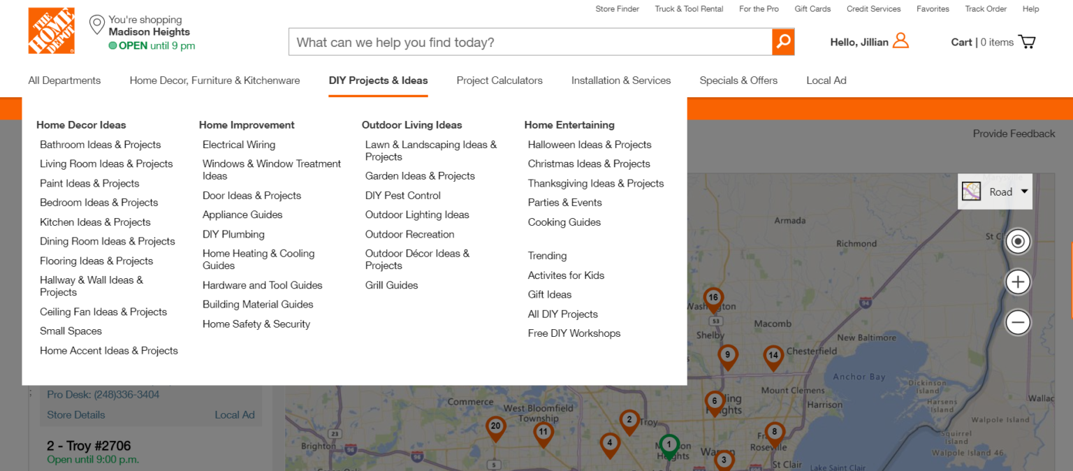
The only exception for drop-downs is developing a mega menu to organize your navigation if you have a large number of categories or products. For example, large retailers like Wayfair and Home Depot use mega menus because it would be difficult to find a specific category without using the search bar. To make a mega menu more intuitive, utilize sub-categories under the primary category to keep your pages organized and clear for users to find.
5. Design for All Users
To develop a navigation that delivers an exceptional user experience, you need to design for all users. It’s essential to recognize that while you may have a target audience, they are all different. You have both desktop and mobile users, tech-savvy individuals and the elderly, and disabled users who have specific needs. In fact, there are over 285 million people worldwide who have visual disabilities and differences.
For navigation to be successful, you need to identify all user challenges that might occur and develop solutions around them. Consider adding the following solutions to make your navigation more accessible:
- Develop an X to close out the navigation or sub-navigation
- Include larger font sizes
- Increase contrast between colors to make it easier to read
- Include alt-text on images and captions on videos
By developing with accessibility in mind, you’re able to create a better user experience for all your potential customers, which could result in higher conversion rates.
6. Test on Mobile
With 3.7 billion people accessing the internet from a smartphone, your navigation must render correctly across all mobile device sizes. With more people using their smartphones for everything from shopping to looking up a local pizza restaurant, your intuitive website navigation needs to be 100% mobile-friendly to meet consumer demand.
When testing, verify the navigation labels are easy to read and have a larger font size. To meet accessibility standards, using 16px font size is typically a good default to work with. The navigation options also need to be easily clickable with a physical size and target touch of about 9mm.
Develop Memorable User Experiences with a Strong Navigation
Your navigation has never been more critical. With a competitive digital landscape and more options available for consumers, your navigation needs to provide the right answers for users looking for solutions. A strong navigation not only guides users to the right pages but also is more likely to result in conversions and future website visits.
When developing an intuitive navigation, consider the following tips:
- Choose a predictable location for your users to easily find
- Keep the category options short and descriptive
- Create a clear path that guides the user to converting
- Remove drop-down menus to eliminate the number of clicks
- Design with accessibility for all users
- Test navigation on all mobile devices
Download The Essential Tools of Digital Experience Analytics to discover the place for each tool in your digital experience strategy, and how to get the most out of them to maximize actionable insights.