7 Key Metrics for Evaluating Mobile App Experiences

At the enterprise level, the success of your mobile app – like increased engagements, sales, and loyalty – hinges on your ability to deliver and optimize those user experiences (UX). Companies that prioritize and effectively manage customer experiences are 3x more likely than their peers to blow away their top business goals.
As an analyst or optimizer, you know it’s crucial to establish a metric as your key performance indicator (KPI) to effectively monitor and measure UX performance across your mobile app.
Similar to a car’s ‘check engine light’ warning the driver of required maintenance, your KPI will indicate critical times to implement optimizations to improve mobile app experiences. And if user experiences are fully optimized, they can increase a company’s KPIs up to 83%.
So, which metric is best suited to be used as a KPI to measure the quality of customer experiences on your mobile app?
In our survey report with Econsultancy, over 300 companies were asked to indicate the metrics they find most effective for measuring online experiences and the results yielded 11 highly popular metrics. Combining this survey data with insights from our product experts, we’ve identified the 7 most relevant metrics to consider as your KPI for evaluating your mobile app experiences.
1. Time on screen
A user’s time on screen allows you to measure app experiences leading to longer versus shorter sessions. These differing session times indicate how certain experiences impact a user’s time on screen, and you can dig into session lengths that don’t match the expected time on screen for each journey.
In most cases, time on screen data is more descriptive of user sessions rather than prescriptive for new optimizations. For instance, a short session could mean the content a user found what they needed in the first or second screen, not necessarily because they grew frustrated and abandoned – so time is not always tied to experience quality.
2. App launches
App launches are comparable to repeat visits on websites: they track how often users reopen and use a mobile app. This is nearly always a positive sign as you can identify the positive experiences prompting those users to return and re-engage. From here you may discover the best performing mobile app journey and try to replicate those positive experiences across lower performing journeys.
However, analysts cannot easily pinpoint whether related experiences versus various buying factors promote more app launches. Without certainty, optimizing experiences using this data could backfire if the patterns deduced are just coincidental rather than real trends behind mobile app experiences.
3. Engagement rate
Engagement rates indicate how often your users interact with your mobile app, which provides a clear view of how well in-app experiences keep users interested. From evaluating navigation, screen layout, and on-screen elements to determining the success of content and designs, engagement rates act as a useful measuring stick for identifying which experiences captivate versus bore users.
While useful for gauging user interest, engagement rates are also highly depending on any user’s given goal. The intended goal may take several touches to complete or in some cases none at all. This makes it truly challenging to determine whether experiences actually good, bad, or just coincidence.
4. Conversion rate
Conversion rates highlight your mobile app’s success in bringing customers to complete an intended call- to-action – whether it’s a sale at checkout or opening a new bank account. This enables you to understand which types of experiences lead to more in-app conversions versus those that lead to fewer.
Unfortunately, too many variables like price and selection affect purchasing decisions, which makes conversion-based experience data highly unreliable. Perhaps you have several popular products that create so much demand it supersedes experience issues like slow loading screens or unresponsive buttons within those mobile app experiences.
5. Net Promoter Score (NPS)
A notable industry favorite, Net Promoter Score gauges experience quality through the likelihood of customer referrals. With NPS, you can determine which in-app journeys are tied to high-loyalty customers raving about their experiences, and further investigate their journeys to find screens and content contributing to those positive results.
The key flaw here lies in broad scoring data failing to point at specific mobile app experiences impacting that customer loyalty. This forces analysts to make tedious correlations and estimations based on this data, which makes mobile app optimizations imprecise and potentially even counterproductive.
6. Customer Satisfaction Score (CSAT)
Among the most-used CX metrics, CSAT allows you to determine the general levels of customer satisfaction. As it translates to mobile app experiences, teams can analyze which in-app journeys correlate with positive versus negative scoring feedback and investigate accordingly. This is a useful practice for categorizing productive versus poor mobile app experiences.
While you can make connections between feedback and user experiences, this data is subjectively based on customer opinions and fails to link to specific in-app experiences affecting those CSAT scores. This limits optimizers from definitively identifying and improving nuanced issues like a clunky user interface affecting scoring feedback.
7. Digital Experience Score (DXS)
The core pitfall of the customer experience metrics listed so far comes from a lack of definitive data that optimizers and analysts need to pinpoint and improve poor in-app experiences. This uncertainty can seriously limit the success of your mobile app optimization efforts.
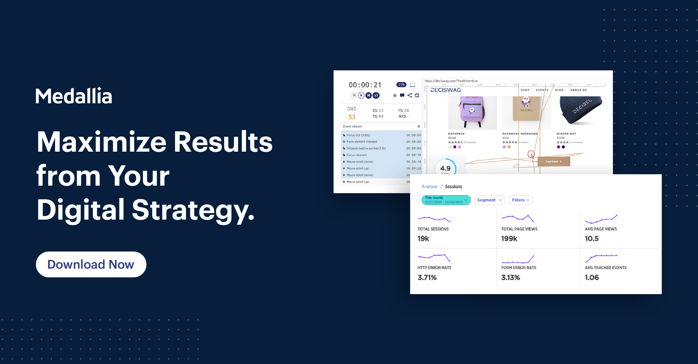
To reveal the unknowns of mobile app experiences, Medallia Digital Experience Analytics created the Digital Experience Score (DXS): a holistic metric that automatically measures online experiences and identifies poor experiences impacting results.
- What separates DXS from a typical customer experience metric?
- Powered by AI for enterprise scalability and efficiency
- Automatically crunches millions of data points and scores quality from 1-10
- Tracks user behaviors indicating frustration or engagement
- Measures 5 pillars of experience data like navigation and technical experiences
- Trusted by major global brands like Adidas and Fidelity International
Leader of Global Ecommerce Shopper Experience at LEGO, Tim Murphy highlights that “with DXS we finally have a quantifiable score that can be easily communicated to all levels of the company – from C-level down to the developers.” Using DXS, you can definitively quantify the quality of user experiences and predict results at the enterprise level without any second-guessing.
Implement & Follow a Simple Process for Optimizing Digital Experiences
With the pros and cons of the most relevant mobile app metrics laid out, your team can align on one and establish a clear view of how user experiences perform and when you’ll need to optimize them.
However, it takes more than a benchmarking KPI to roll out highly successful improvements that will move the needle on engagements, conversions, and more. In fact, 70% of CX leaders said they struggle to design projects that increase customer loyalty and achieve results.

Download The Essential Tools of Digital Experience Analytics to discover the place for each tool in your digital experience strategy, and how to get the most out of them to maximize actionable insights.


